Gleam Haven recognizes that color in event decoration is a potent force, shaping emotions and ambiance. Our meticulously curated palettes are designed to elevate spaces from mundane to magnificent. We understand the science behind color’s impact, crafting experiences that resonate deeply with attendees. This focus on color transformation is central to our design philosophy.
This article explores the art of color in event design, focusing on the importance of well-chosen palettes. We will reveal Gleam Haven’s exclusive color trends, showcasing how we create luxurious and impressive spaces. By understanding the secrets behind our decor, you can appreciate the intricate process of crafting unforgettable atmospheres.
The Importance of Color Palettes in Event Decoration
Color psychology plays a crucial role in how we perceive and experience our surroundings. Each color carries its own set of associations and emotions:
Warm Colors (Reds, Oranges, Yellows)
")
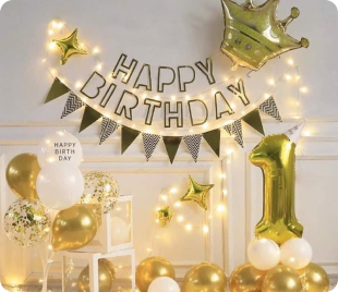
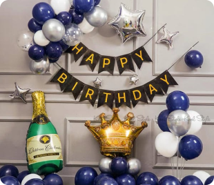
Warm colors, encompassing reds, oranges, and yellows, are the lifeblood of energetic events. These hues stimulate the senses, fostering excitement and a palpable sense of warmth. Ideal for celebrations, they inject vibrancy into any setting. Red, with its passionate intensity, commands attention, while orange radiates enthusiasm. Yellow, the color of sunshine, brings joy and optimism. Together, they create an atmosphere that encourages interaction and lively engagement, making them perfect for festive gatherings and dynamic events.
Warm colors, encompassing reds, oranges, and yellows, are the lifeblood of energetic events. These hues stimulate the senses, fostering excitement and a palpable sense of warmth. Ideal for celebrations, they inject vibrancy into any setting. Red, with its passionate intensity, commands attention, while orange radiates enthusiasm. Yellow, the color of sunshine, brings joy and optimism. Together, they create an atmosphere that encourages interaction and lively engagement, making them perfect for festive gatherings and dynamic events.
In event decor, warm colors are versatile tools for creating specific moods. Reds can signify romance or power, oranges convey playfulness and creativity, and yellows inspire happiness and clarity. When combined, they offer a spectrum of emotional responses, perfect for diverse event themes. Whether it’s a lively birthday party or a dynamic corporate event, warm colors ensure a memorable experience. Their ability to infuse spaces with energy and warmth makes them a staple in creating engaging and impactful environments.
Cool Colors (Blues, Greens, Purples)
")
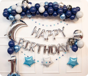
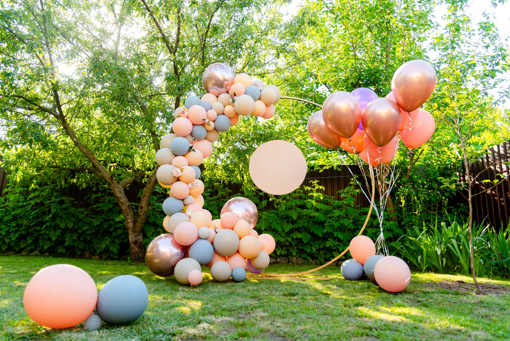
Cool colors, including blues, greens, and purples, are essential for crafting serene and sophisticated atmospheres. These hues evoke calmness and tranquility, making them perfect for elegant gatherings. Blue, with its association with the sky and sea, promotes relaxation and peace. Green, symbolizing nature, brings a sense of balance and harmony. Purple, a color of royalty, adds a touch of luxury and mystery. Together, they create spaces that are both visually appealing and emotionally soothing, ideal for formal events.
The psychological impact of cool colors is profound. Blues, greens, and purples are known to lower heart rate and reduce stress, fostering a sense of calm. These colors are ideal for events where a refined and tranquil ambiance is desired. From a deep blue gala to a lush green garden party, these colors transform spaces into havens of peace. Their ability to evoke feelings of serenity and sophistication makes them indispensable in creating elegant and memorable experiences.
In event decor, cool colors are versatile tools for creating specific moods. Blues can signify trust and stability, greens convey growth and renewal, and purples inspire creativity and wisdom. When combined, they offer a spectrum of emotional responses, perfect for diverse event themes. Whether it’s a sophisticated wedding or a formal corporate event, cool colors ensure a refined experience. Their ability to infuse spaces with tranquility and elegance makes them a staple in creating impactful and memorable environments.
Neutral Colors (Whites, Grays, Beiges)
")
These colors provide a sense of balance and harmony. They can be used as a backdrop to highlight other colors or to create a minimalist, modern aesthetic.
A well-chosen color palette can:
Set the Mood

Neutral colors, like whites, grays, and beiges, offer essential balance and harmony. They serve as a perfect backdrop, allowing vibrant hues to truly shine. These colors foster a minimalist, modern aesthetic, providing a clean and sophisticated canvas. A well-chosen palette, starting with neutrals, sets the mood, evoking specific emotions. This foundation ensures a cohesive atmosphere, crucial for any successful event.
By utilizing neutral tones, event designers create serene and adaptable spaces. These colors provide a sense of calm, allowing other elements to take center stage. A carefully selected color palette, built upon neutrals, effectively sets the mood. Colors evoke emotions, transforming a space into a vibrant celebration or a tranquil retreat. This strategic use of color creates the desired atmosphere, enhancing the overall event experience.
Neutral palettes are key to achieving visual harmony. They offer a versatile foundation, highlighting accent colors and fostering a contemporary feel. A well-constructed color palette, leveraging neutrals, directly sets the mood. Each color elicits unique emotions, shaping the event’s atmosphere. This deliberate use of color ensures a memorable and impactful experience, reflecting the desired ambiance.
Create Visual Harmony

Creating visual harmony is paramount in event decor. A cohesive color palette ensures that every element, from linens to lighting, works together seamlessly. This unity prevents clashing colors and maintains a polished look. Harmonious palettes create a sense of balance, making the space feel both inviting and sophisticated. This cohesive approach enhances the overall aesthetic, leaving a lasting impression on guests.
Creating visual harmony is paramount in event decor. A cohesive color palette ensures that every element, from linens to lighting, works together seamlessly. This unity prevents clashing colors and maintains a polished look. Harmonious palettes create a sense of balance, making the space feel both inviting and sophisticated. This cohesive approach enhances the overall aesthetic, leaving a lasting impression on guests.
Visual harmony is achieved through careful selection and application of a cohesive color palette. This ensures that all decor elements, from flowers to furniture, blend seamlessly. A harmonious palette creates a visually appealing environment, where every detail contributes to the overall aesthetic. This unified approach enhances the event’s ambiance, providing a polished and sophisticated setting for guests to enjoy.
Enhance Branding

For corporate events, color palettes are vital for enhancing branding. A well-chosen palette reinforces brand identity, ensuring consistency with logos and marketing materials. Colors convey specific messages, aligning event decor with company values. This strategic use of color strengthens brand recognition, leaving a lasting impression on attendees. Effective branding through color creates a cohesive and professional environment.
Color palettes play a crucial role in enhancing brand messaging at corporate events. By mirroring brand colors in decor, companies reinforce their identity. This visual consistency strengthens brand recall, making events more impactful. A carefully selected palette communicates professionalism and attention to detail. This strategic use of color aligns event aesthetics with brand values, enhancing the overall brand experience.
Color palettes play a crucial role in enhancing brand messaging at corporate events. By mirroring brand colors in decor, companies reinforce their identity. This visual consistency strengthens brand recall, making events more impactful. A carefully selected palette communicates professionalism and attention to detail. This strategic use of color aligns event aesthetics with brand values, enhancing the overall brand experience.
Influence Perception of Space

Color profoundly influences how we perceive space. Light colors, such as whites and pastels, create an illusion of spaciousness, making small rooms feel larger. Conversely, dark colors, like deep blues and grays, foster intimacy, ideal for cozy settings. Strategic color choices can transform a space’s perceived size and atmosphere. Understanding this impact allows designers to optimize event spaces, ensuring they meet the desired ambiance.
The psychology of color plays a pivotal role in spatial perception. Light hues reflect light, expanding the perceived boundaries of a room. Dark shades absorb light, creating a sense of closeness and warmth. This understanding is crucial for event planning, where space optimization is essential. By manipulating color, designers can enhance the comfort and visual appeal of any venue, tailoring it to the event’s specific needs.
Color effectively alters our perception of spatial dimensions. Light colors visually expand spaces, making them feel airy and open. Dark colors, on the other hand, create a sense of enclosure, perfect for intimate gatherings. This ability to manipulate space through color is a powerful tool in event design. By carefully selecting hues, designers can transform any space, ensuring it aligns with the event’s desired atmosphere and enhances the overall experience.
Gleam Haven’s Exclusive Color Trends
At Gleam Haven, we stay ahead of the curve by constantly researching and developing innovative color trends. Our signature palettes are designed to reflect the latest styles and preferences, while also incorporating timeless elements that ensure lasting appeal. Here are a few of our exclusive color trends:
“Ethereal Glow”

“Ethereal Glow” presents a gentle palette where soft pastels intertwine with shimmering metallics. This fusion creates a dreamlike and romantic ambiance, reminiscent of a beautiful reverie. The delicate hues of blush pink, mint green, and lavender purple interweave with the gleam of gold and silver shimmers, evoking a sense of ethereal elegance and refinement.
This palette conjures images of wispy clouds at dawn, where sunlight filters through dewdrops. “Ethereal Glow” is more than a color scheme; it’s a narrative of tenderness and romance. The pastel shades convey warmth and intimacy, while the metallics add a touch of starlight, like celestial bodies in the night sky.
“Ethereal Glow” is the perfect choice for those who appreciate refined beauty. This palette lends itself to various applications, from interior design and fashion to makeup. The blend of pastels and metallics creates a timeless aesthetic, both contemporary and classic, fostering an environment that is vibrant and inspiring.
“Urban Chic”

“Urban Chic” embodies a bold and dynamic aesthetic, perfectly suited for contemporary events. It thrives on the interplay of striking, contrasting colors, such as deep charcoal grays against vibrant electric blues or stark whites. Sleek, modern textures like polished concrete, metallic accents, and smooth glass surfaces further enhance the urban feel. This combination creates an atmosphere of sophisticated edginess, reflecting the energy and vibrancy of city life.
This style embraces clean lines and minimalist design principles, prioritizing functionality and a sense of refined simplicity. The use of geometric patterns and abstract art adds a touch of artistic flair, while strategic lighting highlights the sleekness of the chosen materials. “Urban Chic” exudes a sense of confidence and modernity, making it an ideal choice for events that aim to capture the spirit of contemporary urban living.
The “Urban Chic” palette is versatile, allowing for both bold and understated interpretations. It can be adapted to various event settings, from art gallery openings and corporate gatherings to trendy cocktail parties. The key is to maintain a balance between the bold color choices and the sleek textures, ensuring that the overall effect is one of sophisticated urbanity. This aesthetic appeals to those who appreciate a modern, edgy, and effortlessly stylish ambiance.
“Nature’s Embrace”

“Nature’s Embrace” is a design philosophy that seamlessly blends earthy tones and vibrant greens, effectively bringing the tranquility of the outdoors into interior spaces. This harmonious combination evokes a sense of calm and rejuvenation, reminiscent of a peaceful forest or a lush garden. The palette features rich browns, warm beiges, and deep greens, creating an organic and inviting atmosphere.
This approach goes beyond mere color selection, encompassing the integration of natural materials such as wood, stone, and woven textures. It also emphasizes the importance of natural light, which enhances the vibrancy of the greens and the warmth of the earthy tones. The inclusion of live plants and botanical patterns further reinforces the connection to nature, fostering a sense of well-being and tranquility.
“Nature’s Embrace” is ideal for creating spaces that promote relaxation and a sense of harmony. It’s suitable for a range of settings, from residential interiors to wellness centers and offices. The focus on natural elements and calming colors helps to reduce stress and enhance productivity, making it a versatile and timeless design choice.
“Jewel Tones”

“Jewel Tones” is a color scheme that captures the essence of luxury and grandeur through the use of rich, saturated hues. Inspired by precious gemstones, this palette features colors like emerald green, sapphire blue, and ruby red, each exuding a sense of opulence. These deep, vibrant colors create a dramatic and sophisticated atmosphere, perfect for spaces that aim to make a bold statement.
The “Jewel Tones” palette is not only visually stunning but also evokes a sense of history and tradition. These colors have been associated with royalty and wealth for centuries, adding a touch of timeless elegance to any design. When used in interior design, “Jewel Tones” can create a sense of drama and depth, making a space feel both luxurious and inviting.
To fully appreciate the beauty of “Jewel Tones,” it’s important to consider the interplay of light and texture. Velvet, silk, and other luxurious fabrics can enhance the richness of these colors, while metallic accents can add a touch of sparkle and shine. This palette is ideal for creating spaces that are both glamorous and comfortable, offering a perfect balance of opulence and warmth.
Secrets to Creating Impressive, Luxurious Spaces
Creating a truly impressive and luxurious space requires more than just choosing the right colors. It’s about how you use them. Here are some key tips:
Layering Colors

Layering colors involves using various shades and tints of a single hue to create depth and dimension in your artwork. Shades are created by adding black to a color, making it darker, while tints are made by adding white, lightening the color. This technique allows for subtle transitions and a sense of volume.
By carefully layering these shades and tints, you can build up a complex and realistic image. For example, when painting a landscape, you might use darker shades of green for the shadows under trees and lighter tints for the highlights on leaves. This layering effect adds visual interest and makes the artwork more engaging.
Balancing Warm and Cool Colors

Balancing warm and cool colors is essential for creating a visually appealing composition. Warm colors like red, orange, and yellow evoke feelings of energy and excitement, while cool colors like blue, green, and purple convey calmness and tranquility. By carefully combining these colors, you can achieve a harmonious and dynamic effect.
When using warm and cool colors, consider their proportions and placement. A dominant cool color can be balanced with small accents of warm colors, or vice versa. This creates a sense of visual equilibrium and prevents the artwork from feeling overwhelming or unbalanced. Experiment with different combinations to find the perfect balance for your desired mood.
Using Textures

Incorporating textures into your artwork can elevate it from ordinary to extraordinary. Textures like velvet, silk, and metallic finishes add a tactile dimension, inviting viewers to not only see but also imagine feeling the artwork. This creates a more immersive and engaging experience, making the piece more memorable and impactful.
The interplay of different textures can also create visual contrast and depth. For instance, juxtaposing a smooth, glossy surface with a rough, matte one can highlight the unique qualities of each texture and add a sense of dynamism to the composition. Experimenting with various textures allows you to express your creativity and add a unique touch to your work.
Lighting

Lighting profoundly affects how colors are perceived, influencing their vibrancy and tone. Warm lighting, characterized by its yellow and orange hues, enhances warm colors like reds and oranges, making them appear more intense and inviting. Conversely, cool lighting, with its blue and green tones, accentuates cool colors, giving them a crisp and refreshing look.
Understanding the interplay between lighting and color is crucial in various fields, including photography, interior design, and art. By strategically using lighting, you can manipulate the perceived mood and atmosphere of a space or image, creating a desired effect. For instance, soft, warm lighting can create a cozy ambiance, while bright, cool lighting can evoke a sense of energy and modernity.
Attention to Detail

Attention to detail is paramount when creating a memorable and impactful experience. Every element, from the carefully chosen tablecloths and napkins to the meticulously arranged floral arrangements and centerpieces, contributes to the overall ambiance. Paying close attention to these details demonstrates thoughtfulness and care, leaving a lasting impression on guests or clients.
Attention to detail is paramount when creating a memorable and impactful experience. Every element, from the carefully chosen tablecloths and napkins to the meticulously arranged floral arrangements and centerpieces, contributes to the overall ambiance. Paying close attention to these details demonstrates thoughtfulness and care, leaving a lasting impression on guests or clients.
Conclusion
In summary, Gleam Haven‘s commitment to mastering color psychology and developing exclusive palettes like “Ethereal Glow,” “Urban Chic,” “Nature’s Embrace,” and “Jewel Tones” ensures every event is a sensory masterpiece. By understanding how colors influence mood and space, and by meticulously layering textures and lighting, we transform visions into unforgettable realities.
Ultimately, crafting luxurious spaces hinges on a blend of artistic vision and scientific understanding. Gleam Haven’s dedication to detail, from palette selection to lighting and texture, ensures each event resonates deeply. By prioritizing harmonious color combinations and innovative techniques, we create atmospheres that not only impress but also leave lasting, emotional impressions.
“Gleam Haven’s Signature Color Palettes: The Science Behind Stunning Decor”